

Content is King. I’ve heard it. You’ve heard it. It has probably been said in a thousand different meetings by hundreds of creative directors and project directors. It’s said with all the portentous weight that usually comes from wearing sandals with a black turtleneck, and is often used to end a discussion. Well, stop saying it. Not just because it’s a tired cliché, but because it’s virtually meaningless since the definition of ‘content’ depends on who you ask. Here are a few reasons why.
Bias
Ever hear that old saying, “When you’re a hammer, everything looks like a nail?” To a graphic artist, content is a beautiful graphic of some kind. To an engineer, it’s a feature or statistic. For a composer, it’s a score, and so on. Gender1, age, and social status can also have a huge influence on what is or isn’t relevant.
Things go sideways when you don’t adequately research the target demographic, or the client (or key stakeholder) and the consumer are not the same demographic, but the client thinks he knows better.

For example when designing advertising for a piece of software, if the client is engineering, they may insist on emphasizing key features that they worked very hard to implement (and are rightfully very proud of). The problem is that a feature is not emotionally compelling, and a list of features is not an emotional narrative. Narrative is what sells a product. The narrative tells them that their life will be easier, more productive, more enjoyable, or that they’ll stay connected to their loved ones. Capacity, triptronic shifting, or parallel processing may do those things, but won’t communicate it in a meaningful way to non-engineers, especially when in the form of a chart or bullet-list.
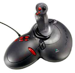
Sometimes the art director is the de-facto client, able to sell the paying client anything. An example of this is an ad for a Logitech joystick I saw years ago. It featured a sexy photo with back lighting to show off its sensual curves against a black background. Minimal text helped emphasize the shape and directed the eye from top left to bottom right where the logo and product name were. This would have been completely appropriate as a teaser ad for a new sports car; but as an avid flight simulator fan, my first thought was that you couldn’t tell how big it was, or see the layout of any of the buttons or controls. The ad was worse that useless—it came off as pretentious.
The worst, in my opinion, is when the marketing department is the client, as their goal is often at odds with the needs and desires of the customer. Marketing wants to Sell! Sell! Sell! Customers want their stuff, but rarely, if ever, want to constantly be sold and upsold. I saw this when designing the UI for the original Kindle Fire HD2, and to a lesser degree when working on Microsoft Music and Video. I also had to deal with this when at a Silverlight ‘training’ seminar. Instead of training, they had a handful of engineers discuss features, and instead of instructors, they had product evangelists (actual job title). Most of what I learned came from online tutorials I and my cohorts tracked down on our own. Many companies paid to have their employees take this ‘training,’ only to produce free demo materials for Microsoft. Nice. Glad that paid off.
The Customer May Be Smarter Than You
This is something I’ve seen very talented creatives forget. I’m not saying creative professionals are stupid, they’re not. I’m just saying that most of them went to art school. There’s a difference between art school and, say, engineering, computer science, medicine, education, or the average Star Trek fan. More on that later.
I worked, briefly, on the UI for a file sharing type program for a major tech company. There were many challenges, not the least of which was that the user determined the preview image for what they’re sharing. Which means it could look like anything, or nothing at all. Despite this, the creative director insisted on stripping the UI of any and all metadata or titles, fearing it would be ‘too complicated,’ and this is for a demographic better educated, more intelligent than the people creating the UI. What it really was was too complicated for him. The goal was to have a library of dozens, hundreds, or even thousands of items… but with a UI that would force you to click through to see what anything was. Not useful.

Or let’s take another example: Star Trek. Specifically, the 2009 reboot. Over its fifty year history, Star Trek has inspired astronauts, engineers, educators, doctors3, scientists, and even the most important civil rights leader of the 20th century, but there’s nothing wrong with wanting to appeal to a broader demographic… However we’re given a plot point where a supernova is going to destroy the galaxy… so Spock uses an artificial black hole to ‘suck it up.’ It’s so colossally stupid that it’s hard to believe the writers weren’t trying to be insulting. After all, they had NASA consultants. Appealing to wide audience is fine, but treating them like drooling morons isn’t—and neither is treating the core audience’s love of science with contempt4. The movie did make a lot of money (because it was well directed, acted, and produced), which would seem to make my point moot, but the fact is you don’t have to talk down to the audience. Look at the “mind-bending” movie Inception. Sure, it had amazing action sequences, but it required the audience to think, and yet it made more money than either of the new Star Trek movies. Or Nolan’s next film, Interstellar, which had a lot of real science in it. Though it made less in the US, it earned much more world-wide than either Star Trek.
I suppose the lesson here is that whether you create for the lowest possible common denominator or the thinking person, the audience will stoop or rise to either level. It really says more about you than them.
Brand is Not Content

Companies spend untold thousands to create and millions to promote their brand. So I understand how important it can be. Some brands are so recognizable and so popular, like Harley Davidson, that people will buy millions in branded products that have nothing to do with the core business. As the joke goes, there are people so in love with a brand, that they’d buy a bronzed piece of poo with the logo on it… but that really isn’t true. I might buy a Ferrari jacket without owning a Ferrari, but it still has to be a damn cool jacket. If anything, it would have to be even cooler than a normal jacket.
Or take Apple. Like Harley or Ferrari, it’s one of the most recognizable and powerful brands on the planet, a brand demonstrated in the industrial and UI design of every product they produce. But with the exception of a few basic requirements, Apple doesn’t force its visual aesthetic on the tens of thousands of apps being developed for its iOS platform every month. And there are some really cool apps.

And for all the power of brand, the first thing many customers do is customize their new toy, whatever it is. Be it changing the desktop image, to customizing the entire color scheme, buying a protective case, hot-rodding or jail-breaking it, or even removing the branding5 entirely. It doesn’t mean they don’t appreciate the brand, it just means that there’s more to their appreciation than four colors and a font.
Consumers Don’t Want All The Content, They Want Their Content
It’s impressive to get 1.21 million results when you search for something on Google. But nobody wants 1.21 million results. They want the right result.

The same goes for just about anything, be it clothes, running shoes, food, looking for Youtube videos, movies, music. For example, a book store may want to carry the widest range of books possible in order to be able to serve the largest number of people, but a person usually only wants to buy a particular genre, and only a few authors within that genre. Sure, it can be fun to browse, and a few well-chosen suggestions might surprise you with something you’d never have found otherwise, but it can get old, fast.
Can you imagine searching for the latest Song of Ice and Fire novel, but having to click through the Twilight Saga first? Or looking for a particular Yngwie Malmsteen cut but getting back Justin Beeber because the titles share a word and the Beebs is trending?
Forcing a consumer to sift through a million things so you can show off how much content you have (or to satisfy marketing goals) before they get to their stuff isn’t just irritating, it’s counter-productive. People expect and even accept a certain amount of marketing, (especially radio or TV commercials), but doing so in an invasive manner (too often, increasing the volume6, with pop-ups7, by forcing the user to scroll, or when people are paying for a premium service) will erode their brand loyalty. And once that’s gone, it’s hard to get back. Even a wait of a few seconds is enough to put you on their shit list.
In Conclusion
I understand that sometimes you have no choice but to do what the client demands. It happens. However, that doesn’t excuse you from your responsibility to the customer. There are always times during the creative process where you can put up your hand and challenge the notions of the various stake-holders. As long as you have the best interests of the project in mind, have your facts straight, and know when to back off, the worst that can happen is that you’ll annoy someone a little. By making happy, satisfied customers, you, your client, everyone wins.
1 A company I worked for produced a promo video for OneNote that was a parody of the movie Swingers (this was quite a few years ago, so it was much more relevant than it is now). Intended to be a viral video, it was quite a bit outside normal Microsoft marketing in terms of tone and humor. Being Microsoft, there was nothing overtly crude or sexual, though the dialog clearly referenced humor in the movie that was. As far as the target demographic, 20-30 year old males, it tested very well. The video was mere days away from being released into the wild, when a last minute stake-holder at Microsoft killed it. It was killed because the middle-aged female marketing director didn’t think it was funny. It’s not that she didn’t think it would be funny for the target demographic; it wasn’t funny to her, personally. What a waste.

2 I worked on the UI design for the original Kindle Fire HD. It was designed from the beginning to be a media consumption/gateway device; to get people to buy music and videos as well as to make other purchases from Amazon Prime—not to be the best full-color e-reader and multimedia device possible. The directive was to make everything as pretty as possible. Know what isn’t pretty? List views. That’s why you were forced to search through your book library by looking at thumbnails of the book covers. I love cover art just as much as the next guy (Michael Whelan and Frank Frazetta being my personal favorites), but who buys books for their covers? Or music? Or movies? On top of this, Jeff Besos himself demanded a change in the white-on-black reader theme that he knew would cause eye strain— in order to show off how sharp the screen resolution was. Sharp as a needle driven through your pupils. Tension headache… that’s a feature, right?
3. Shatner, William (2008). Up Till Now: The Autobiography. Macmillan. p. 149. ISBN978-0-312-37265-1
4. Nothing says “Fuck Science” quite like naming a planet after the pseudo-science theory of a quack.
5. It’s true. It costs extra to configure your brand new Aston Martin without badges.
6. Do a Google search on this. I did and got back 29.9 million results of people complaining about it. The public has spoken. Stop punching people in the ears.
7. 3.9 Million results. You are guaranteed to piss off around a fifth (or more) of the people who view your pop-up. I guess if all you care about is getting that 0.01% click-through, then this doesn’t matter to you because you’re a sociopath.
